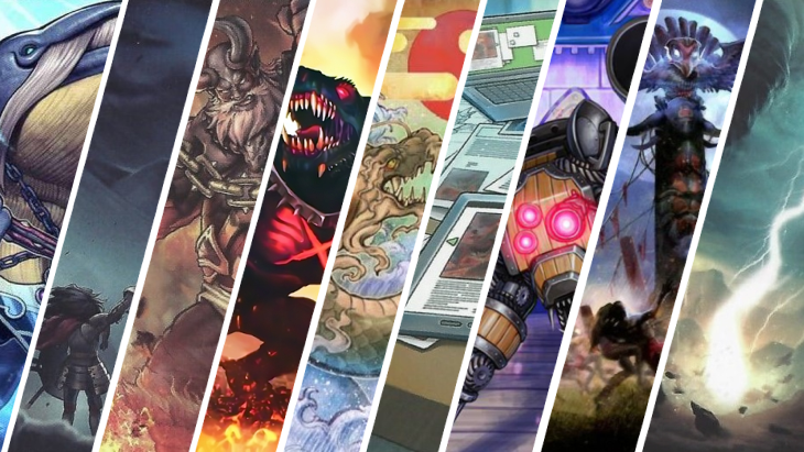
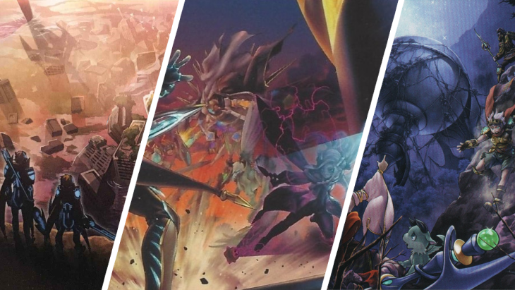
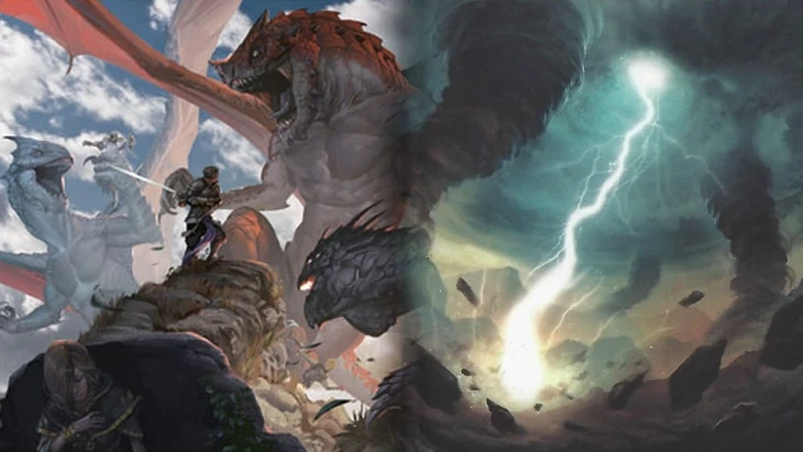
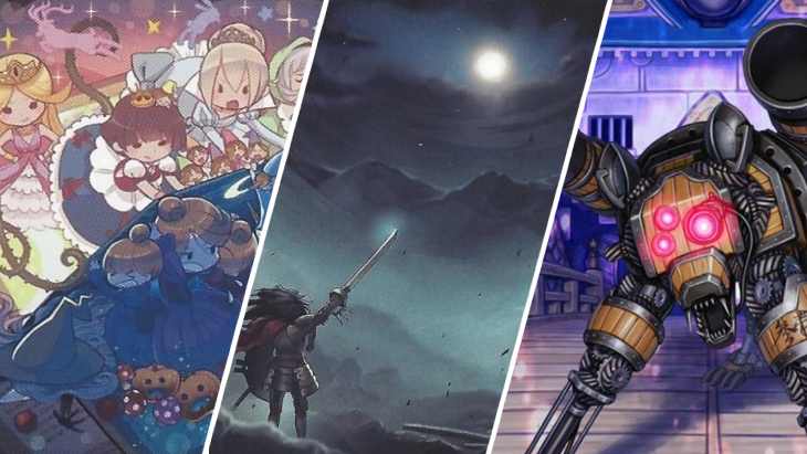
With now more than 10,000 different cards printed, the game's catalogue features a huge range of visual styles and themes in its illustrations. Working within the confines of just a 44 millimeter square, the artists really need to optimize their images. Here are a few of the very best.
I should perhaps preface this article by stating that in my opinion most of the card art in Yu-Gi-Oh! is fairly unremarkable. There's nothing objectively bad about the illustrations, but a majority of the designs are simply not to my taste. That's just how art goes, it's subjective. Keeping that in mind, you shouldn't be upset if I have completely ignored your favorite cards—though do leave a comment about what I might have missed!
10 – Orbital Hydralander
This artwork has no duplicates!
This one might be a bit biased by how much I enjoy using . But it's not just the giant mechanical space hydra that I like here. As with many of my favorite artworks it is the full use of the space. The background really sets the scene. Why waste that extra bit of area when it can be used to help add to the atmosphere?
9 – Mermail Abyssbalaen
If only the card's effect were as good
Quite the opposite to Hydralander, there is certainly no risk that has made the list because of any in-game strength. Very few cards require a player to discard four as a cost, and none offer such little payoff for that investment. What the card lacks in playability, however, it more than makes up for with a giant whale-scale warhammer. The only other Mermail card with art this interesting is , but sadly the storytelling emotion of that one didn't make it through TCG censorship.
8 – Kaijus
Destroying the city in style
Almost all of the Kajiu cards have interesting and carefully designed art. The monsters themselves feature details to showcase the gargantuan size of their subjects. You can see tiny helicopter silhouettes around , and its less aquatic associates feature a selection of destructive cityscapes that wouldn't look out of place in a disaster movie. Even the spells and traps such as neatly tie in with the detail-oriented world building.
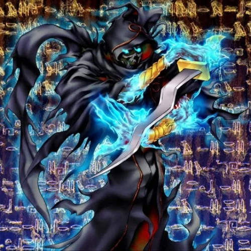
7 – Night Assailant
Vintage card, great art!
As much as most older Yu-Gi-Oh! cards fill me with a fuzzy feeling of nostalgia, there is no doubt that the quality of the artwork has improved over the years. Looking back at some of the earliest designs we can definitely be glad of the development! works hard to defy that trend though. First printed in 2004, the card is one of the oldest monsters in the game and certainly one of my favorites from that era.
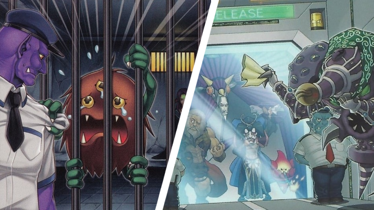
6 – Breaking the Fourth Wall
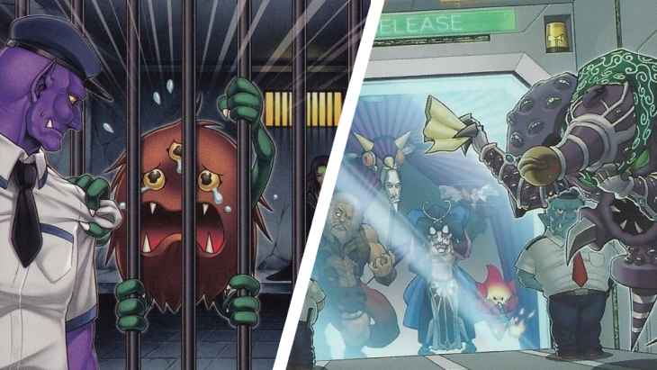
Many prisoners have since finished their sentences
That's not the name of a Yu-Gi-Oh! card, but rather a theme of artwork that I enjoyed seeing each installment of. The Forbidden and Limited list is a huge part of the game as played in tournaments, but with the release of cards like , , and we began to see a story of forbidden monsters being imprisoned for crimes within the world of the cards. My favorite examples of this theme are and , which features different characters but still shares the same sentiment.
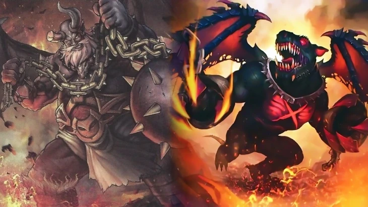
5 – Malebranches of the Burning Abyss
A chilling vision of Malacoda's minions
It should come as no surprise that Burning Abyss monsters would rank among my favorite artworks. I think the art has certainly been a contributing factor to their long-lived popularity. It is not that catches my eye the most though. The Malebranches have always been much more visually interesting to me, particularly , , and . As with a significant proportion of my choices for this list, these cards saw their initial printing without any holographic pictures, and I'm very happy about it. I think that the common (and rare) cards offer a much clearer rendition of the artist's creation, especially where the images are intricately detailed.
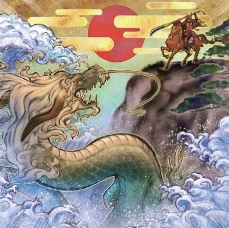
4 – Hollow Giants
A picture worth a thousand words
The visual identity of this card is nothing like any of the others in my Top 10. The sharp contrast to most cards in the game is likely a contributing factor to why it stands out to me. is reminiscent of Japanese ukiyo-e woodblock printing. Despite not having any connection to other cards or characters the card is still able to create a compelling narrative within just a single picture.
3 – The World Legacy Saga
A huge web of interconnected cards
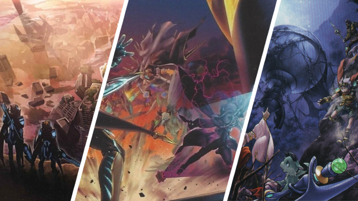
The various cards connected to the World Legacy Lore build up a vast world of connected archetypes, from World Legacy, to World Chalice, Orcust, Mekk-Knights, and even Crawlers. This isn't the first time we have seen a wide range of interconnected cards. Way back in the earliest sets of the game we got the likes of , , and , but as much as they were interesting, they lacked the visual splendor of these newer successors. My top picks from the collection are , , and .
2 – BP03 World Premiere Cards
If only more were playable
There's nothing in-game that particularly ties these cards together, but as a selection of cards with a somewhat similar art style, that all debuted in the same set, it seems appropriate to address them together. On pure visual spectacle alone is definitely the best of the bunch. Sadly, as with so many cards on my list, it isn't even remotely playable. Coming up in tournaments far more frequently is my other selection from the set: is not only great to look at but also links in to the running theme of bad weather meaning bad news for spell and trap cards.
1 – Moon Dance Ritual
My overall favorite
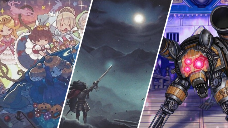
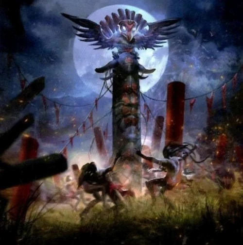
The top spot on my list goes to another card that I have never seen played in a tournament. This card really brings together everything I love about artistic design in the world of Yu-Gi-Oh! illustrations. It reuses existing characters from other cards—we see taking the limelight at the top of the image—and the card effect also ties in with this visual reference. The artwork itself has a great balance of light and shadow. The almost symmetrical layout gives power to the central character but still emphasizes the motion and energy of the dancing. is yet another card among my Top 10 that was released without a holographic picture. Perhaps somebody at Konami agrees that the best artworks should be presented on a crisp common or rare card. I'm certainly happy that they seem to end up that way!
Honorable Mentions
Almost making my list were , , and . They all share elements that I have mentioned above but didn't quite stand out as much as those that earned a Top 10 ranking.
I hope you enjoyed this gallery of cardboard artistry and possibly even found some cards you didn't yet know. Which are your favorites from my shortlist? Is there anything that I have missed? Drop a comment below and let us know!
Opinions expressed in this article are those of the author and not necessarily Cardmarket.