
A Dolphin in a Sea of Whales
I am not a whale when it comes to Magic. I don't mindlessly gorge up supersized servings of cases of whatever products Wizards float in front of me. Rather I consider myself akin to the dolphin, the smarter cousin of the whales. I am an omnivore nibbling a box or a set of more or less everything except for the stuff solely aimed at complete beginners or ravenous whales.

I have never felt that a release didn't have anything to offer for me — at least not since I drifted away from the game around the turn of the century. Perhaps I pass on collector's boosters, but then I get a draft booster to sate my appetite for colorful cardboard instead. Well, there's a first for everything and honestly Double Masters might have me rethinking how I have been buying sealed and randomized product frivolously since I frolicked my way back into Magic.
My cube is after all in a remarkably good place these days, and if I need another Limited environment, I can just build a second cube from my nearly 20,000 unused cards. Then there's my Innistrad battlebox, some sets of preconstructed Challenger Decks, and something approaching two dozen Commander decks. Heck, I even have a silly little Legacy deck, I've been tinkering with.
Should any of those projects need new spice, I could just get the singles — you know where. Sure, it was fun trying to find a place for the cards I opened in sealed product. But each time I ended up sorting and packing most of my Draft chaff of various rarities away to probably never see the light of day again. Then I had to go and buy the desired singles I was missing anyway. But after seeing the choices of reprints (and even more so, re-reprints) Double Masters has likely changed my future purchasing patterns.
Double Masters: A True Game-Changer
Truth be told, I was super excited about Double Masters … until the spoiler season began. Discovering how the reprint value was distributed in the set didn't make me angry or disappointed, just indifferent. The empty feeling only intensified upon seeing the nearly complete lack of creativity when it came to choosing cheap filler chaff. Not giving us players too much value is apparently an important consideration. Here the design team almost exclusively picked recently reprinted cards over cheap but at least different and forgotten cards from the vast back catalogue.
From being certain I was going to spend €250 on a box of what the company now considers the cheap draft boosters for the poor and huddled masses, Wizards succeeded in convincing me that this product is not for me.
Thursday before the release €250 could get you one each of
Unforgettable in Every Way
All that disillusionment aired, there is one thing I truly love about Double Masters and that is the direction Wizards decided to take with the new art and in particular with the new art for the box toppers. I hope it is a trend for the company to take chances with the illustrations, at least when it comes to special releases: We have seen some outrageously different style in some of the Secret Lair drops too.
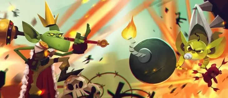
I don't necessarily appreciate all the bold new choices printed on specialty cards. But I prefer to live in a world where some cards have art that blows me away while others are illustrated so tastelessly as to make me laugh — rather than drown in a sea of blandness that can hardly make me muster a meh.
There are some box toppers with even more generic art than usual. A few I don't even think I would remember as being art from Magic cards if someone were to show them to me out of context some years down the line.


Likewise, the new
Now, let's take a look at ten box toppers I actually think we will remember in years to come.
10. Expedition Map – Too Shy
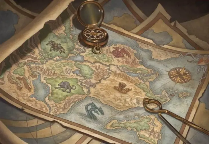
This
A lot of people will want it fresh off the printing press, but will anybody care for it or recall with fondness its acquisition decades later? Being remarkably inoffensive while somewhat cool for the time — like Limahl's Kajagoogoo or those 1970s brown-and-orange bathroom tiles — this card could have some nostalgic kitsch value to someone in the future. Though my guess is most will find it bland and cringeworthy.
9. Wurmcoil Engine – You Spin Me Round
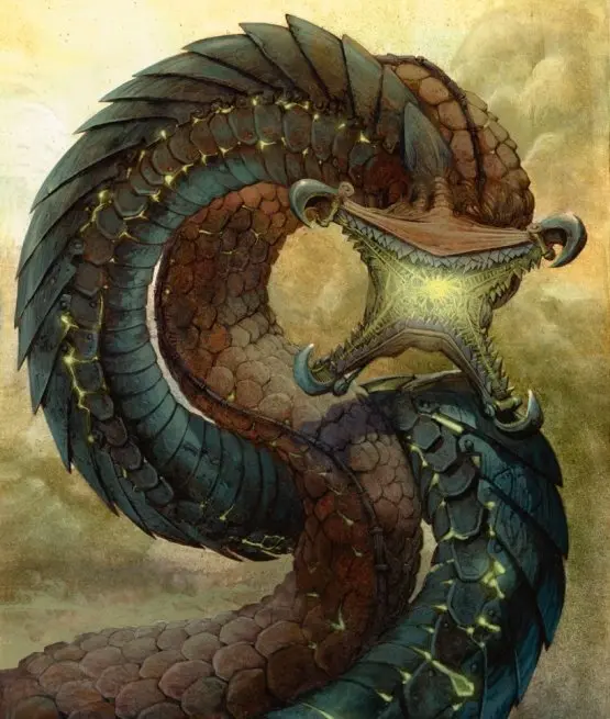
Artist Carl Critchlow originally worked for White Dwarf — which I used to read mostly for the illustrations since I never spent much time playing any of Games Workshop's tabletop games. Debuting as a Magic artist with Weatherlight, I first noticed him during Urza's Saga for his


8. Exploration – Start Wearing Purple

Quite opposite the subtle color choice of Critchlow's previous piece, Mark Poole makes sure that the new box topper art for
By the looks of the prices at the time of writing, the box topper will be remarkably cheaper than my Urza's Saga copy, which makes it a reasonably choice for someone who needs the card for a deck.
7. Dark Confidant – Careless Whisper
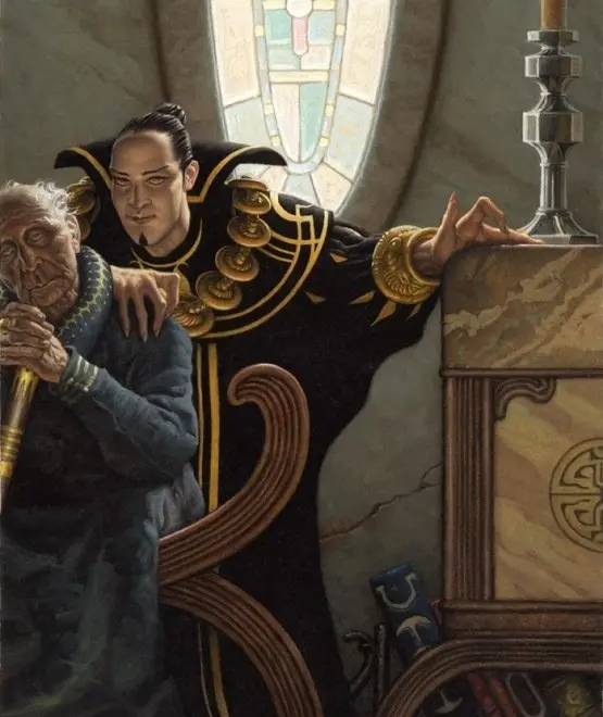
Mark Zug, known for


How future sensitivities will judge the art remains to be seen, but it surely will not be forgotten. Also, this is yet another example of a box topper where the non-foil version doesn't fetch a huge premium over other printings. So anyone not too offended by manbuns could easily go for full art.
6. Thoughtseize – Can I Play with Madness?
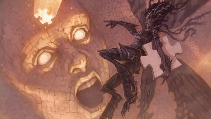
I picked up a copy of the Iconic Masters reprint of
Briclot's art for Thoughtseize is the best — or at least I was convinced of that until I saw the new Chuck Lukacs art in a box opening on YouTube. This illustration was not even on my list for the article at hand, until I saw it there. Now I think it is a piece to remember — unlike the Amonkhet invocation, which I bet most cannot even recall without looking it up. However, at around €40–50 for a prerelease order, this is not the Thoughtseize for me.
5. Blightsteel Colossus – Kung Fu Fighting
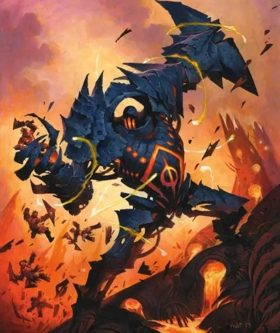
Looking at Wayne Reynolds's new art for the card I feel like quoting Jim Kelly's character, Williams, in Enter the Dragon when he tells the bad guy, "Man, you come right out of a comic book." Because this new art looks exactly right out of a comic book with its saturated colors, tilted horizon, and motion lines. One could argue that the original art is more fitting, since dancing around like an acrobatic martial artist is not something you'd expect from a colossus. But I surely know which version I find more remarkable and which one I would pick if it wasn't for the premium price the box topper comes at.
4. Brainstorm – True Blue
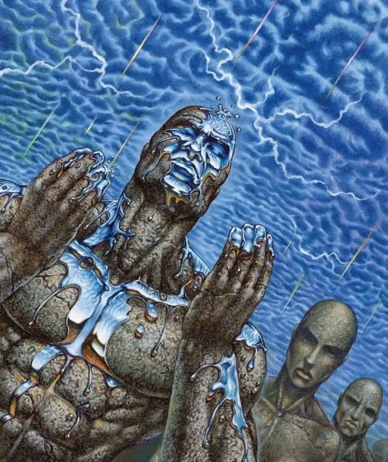
Another artist since Alpha and one of my favorites since his version of


Including the original Brainstorm illustrated by Christopher Rush for Ice Age, the popular common that is restricted in Vintage has been printed with six different pieces of artwork. Chris Rahn's rather literal interpretation with a brain-shaped storm for Masters 25 was the only one I cared for just a little … until now.
Ron Spencer's Brainstorm may have only caught the storm in the moment before the drizzle becomes a downpour. But the art is truly Magic in a way that reminds me of the early days of the game while still being so much better than most of the work from that time. And then it is just so blue! I want it almost enough to pay the nearly €20 prices hovering around at the time of writing, and once — if — it goes below ten for the non-foil, I will probably pick it up for my cube.
3. Crop Rotation – It Was a Very Good Year

Mark Poole is already on this list once. Of course the artist behind the original
2. Urzarama – Making Flippy Floppy

Among the more than 150 cards illustrated by Mark Poole, we find the original version of the four seasons of


Naturally, Tedin's style has developed a lot over the decades, and the panorama he has created for the new Urza's land box toppers is so unique that it more than any other pieces infuses me with hope for the future of Magic art. Tedin's Urzarama somehow reminds me of the covers of a series of books I read as a kid, of which I have not been able to dig up the names. The pastel colors and the lines make for a hand-drawn feel resulting in a truly great work of art — and as a bonus we are even treated to a
Of course, we must also address the elephant in the room: the controversial depiction of the Silver Golem. If everyone agreed on the art, it would be either bad or bland, and personally, I was never a fan of the oh-I'm-so-cool-and-strong old Karn. To me it was as boring as seeing the Gatewatch knock out Nicol Bolas. Quirkiness and unpolished protagonists are for young adults and grownups.


Jason Chan's art for the original Karn planeswalker made me think Magic had become a children's game. Mark Tedin instead treats us to a
1. Toxic Deluge – With a Taste of a Poison Paradise
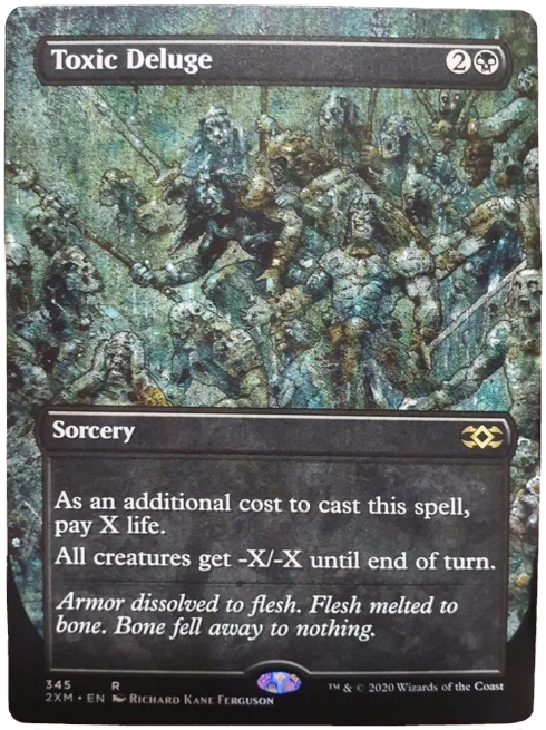
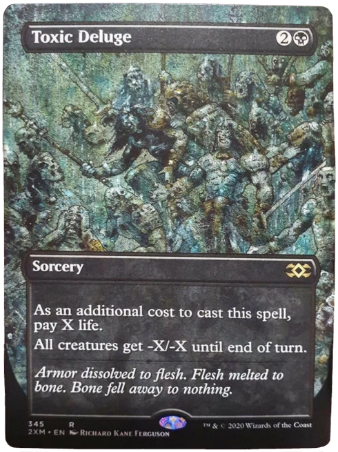
Richard Kane Ferguson is back! One of the most memorable and coolest Magic artists who for a long time was one of the few whose name I even cared to remember: an illustrator with his own remarkable style.
Since Eventide Ferguson has only done the awesome piece for


I don't know if anyone needed more Apprentice Wizards — they could have had my Fourth Edition copies which have not seen play for 25 years. But Toxic Deluge, now there's a much-needed reprint and card that won't end up in a bulk box. Contemplating how to spend all the money I saved by not getting a box of Double Masters, I have come to the conclusion that this is the only card that I won't think twice about paying the premium for.
As with all things concerning art, it is all a matter of personal taste. Perhaps you are more interested in the new art that wasn't featured on box toppers, and perhaps you find other box toppers more memorable. As always, I look forward to reading what you have to say, so please share your insights about Double Masters art and economy in the comment section below.
Opinions expressed in this article are those of the author and not necessarily Cardmarket.