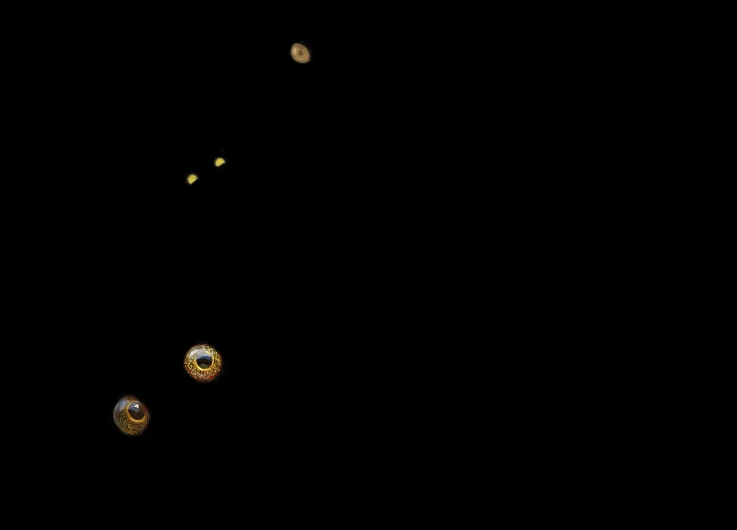
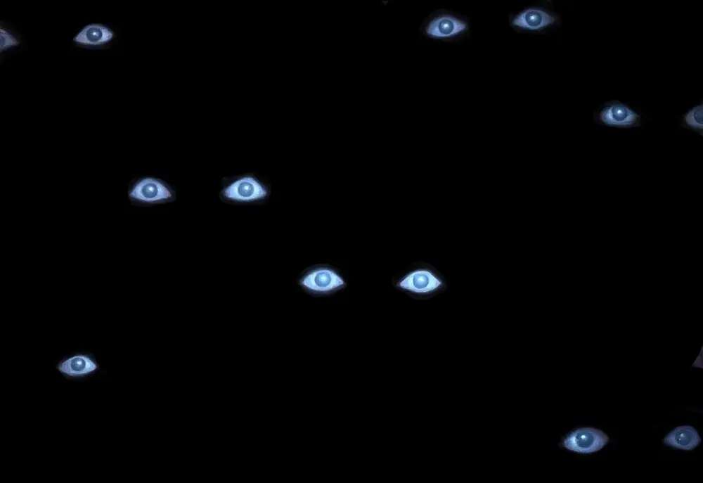
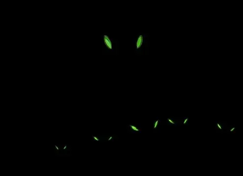
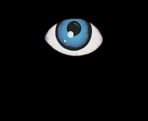
Our Halloween contest concluded last night with 38 cards successfully figured out and two illustrations that went unrecognized to the end. Everyone who won a prize should have the credit added to their account by now. The unclaimed leftover prizes will of course find their way into the prize pool for a future contest.
Apropos credit, we also need to pay our respects to the artists without whose work none of this would be possible. For obvious reasons, we couldn't list their names last week, but we shall rectify that now. Below, I'll go through all of the images in tiers based on the order in which they were identified, which is also how we awarded prizes. You can move your mouse cursor over each graphic to reveal the full art. (If this doesn't work on your phone, well, you really should enjoy them on a bigger screen anyway.)
Finally, please leave a comment and give us your feedback! Were there too many easy artworks? Not enough of medium difficulty? How did you like the time-critical nature of this contest compared to the mail-in system and raffle we used before? Let us know and you can actually influence the design of upcoming projects in a meaningful way!
Tier €1 – Easy Money
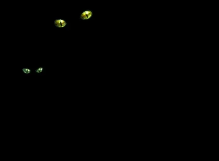
Image 1:
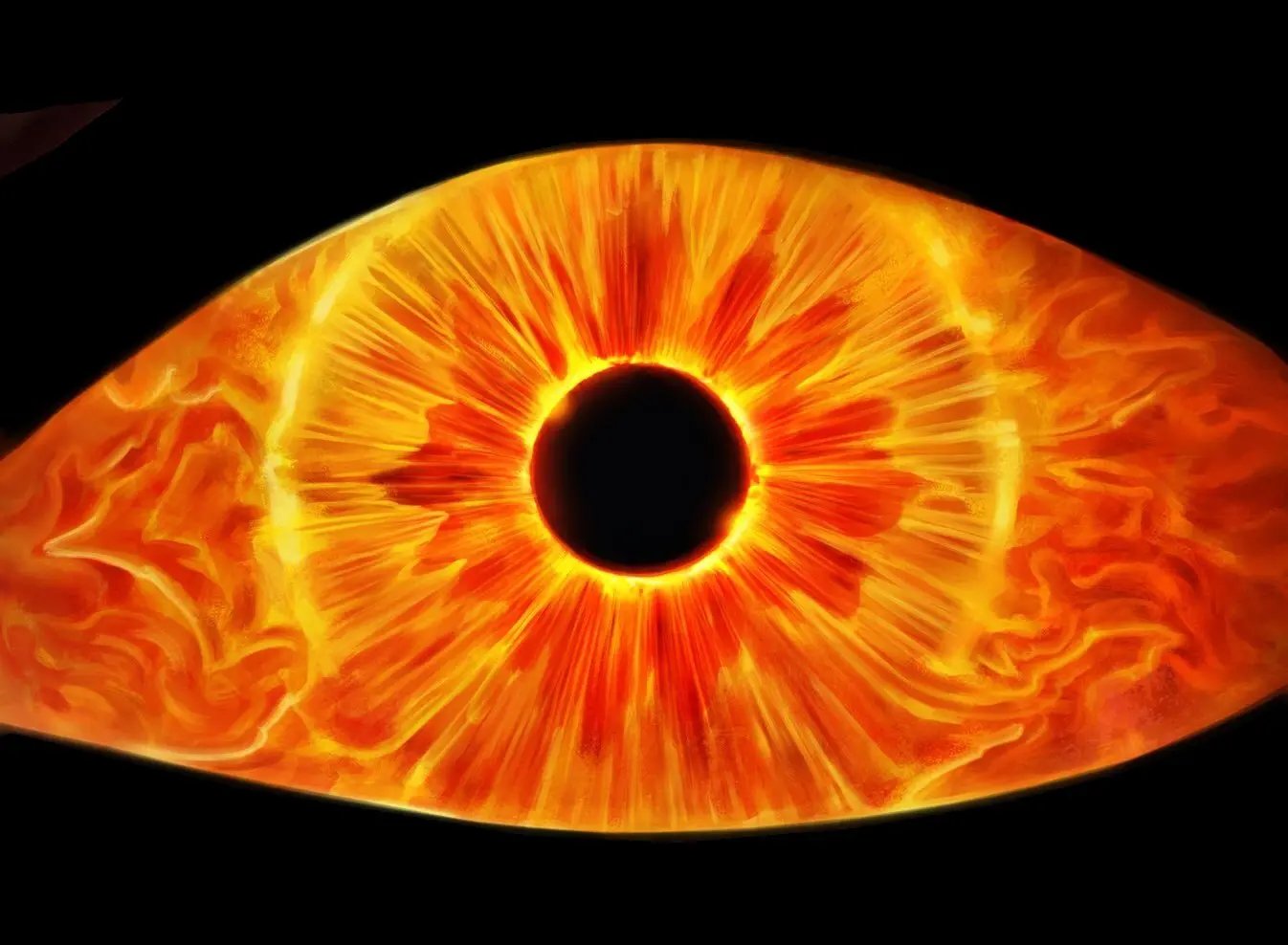
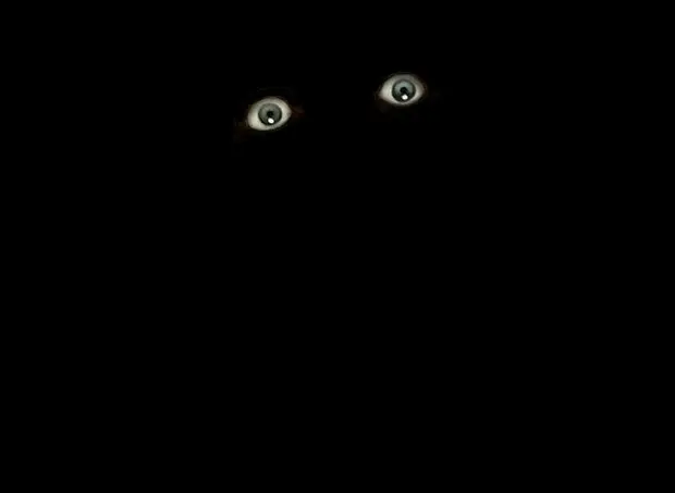
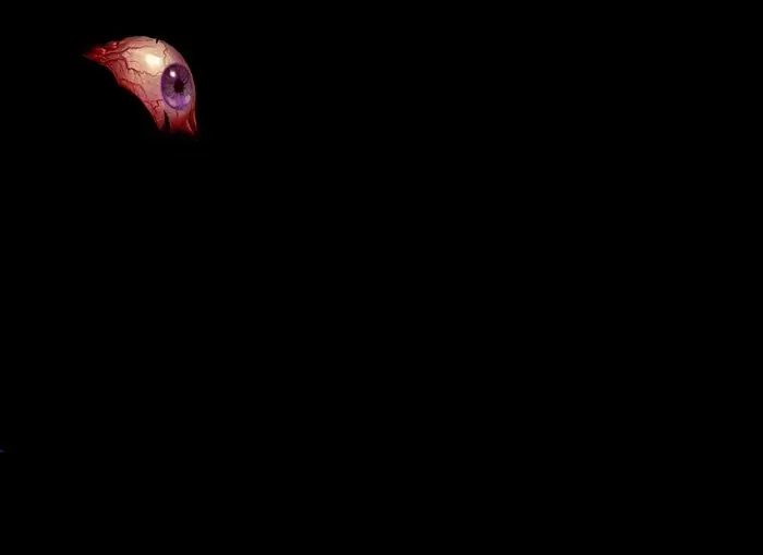
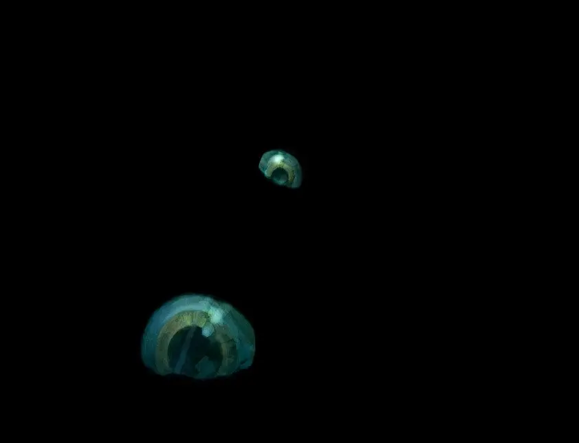
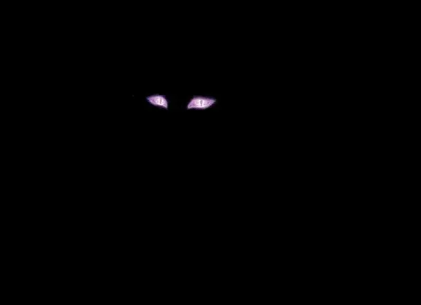
When I was young, my mother used to tell me I'd get square eyes if I didn't stop staring at a screen. With , Kieran Yanner shows us what happens when you gaze into a Palantir for too long.
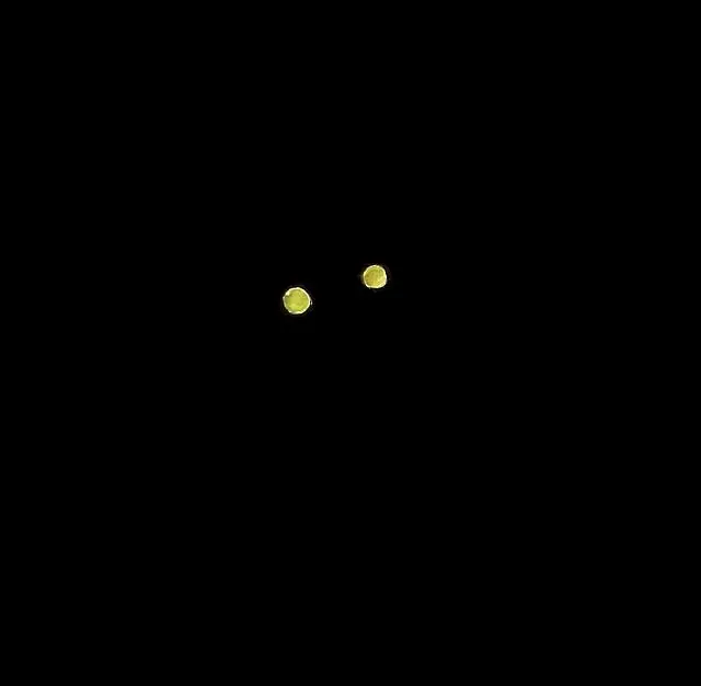
Image 2:
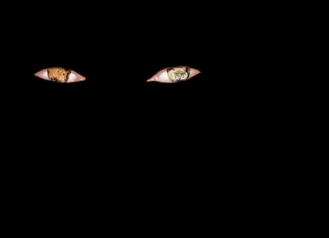
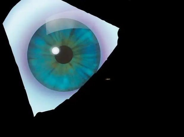
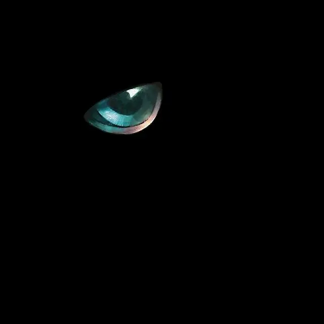
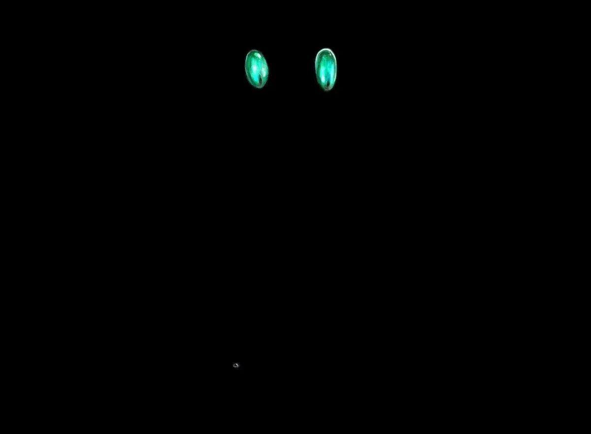
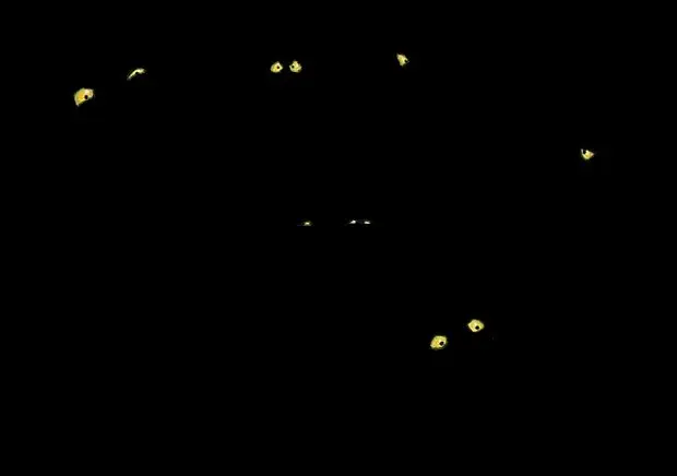
Ron Spears used to depict Kamahl's reformation from red to green . The character has "seen life's purpose," and you can see the wild life of wildlife in his eyes too.
Image 25:
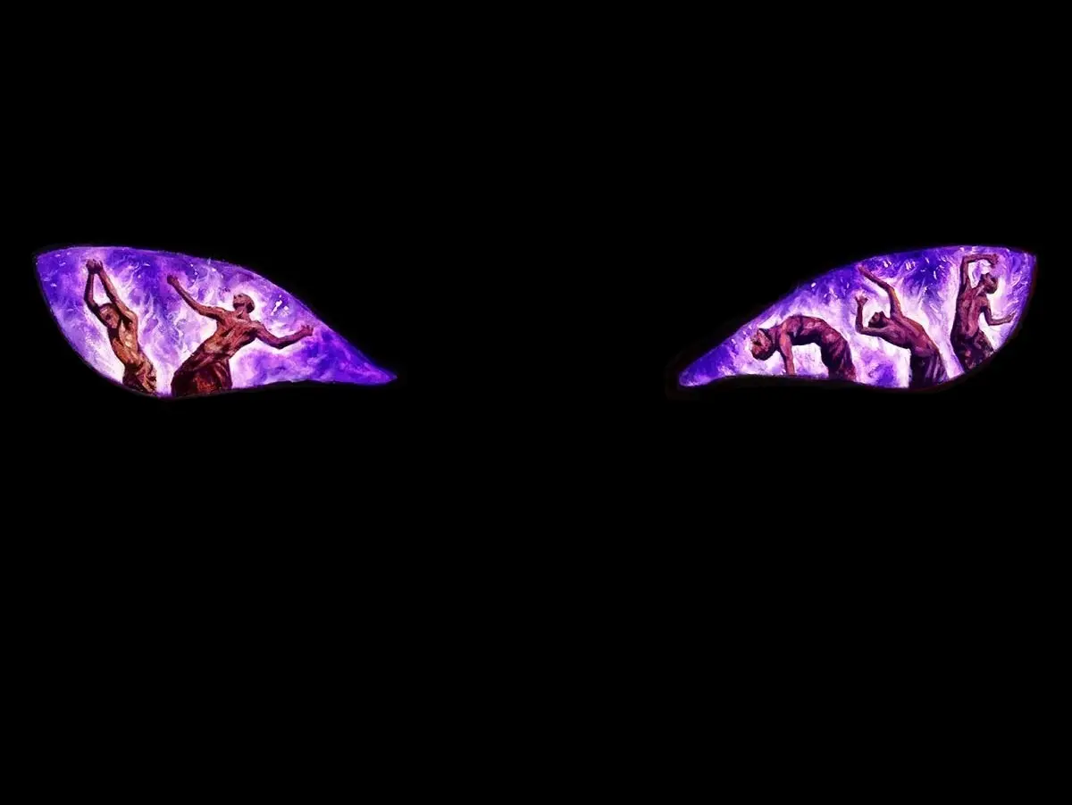
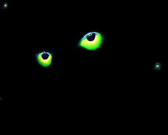
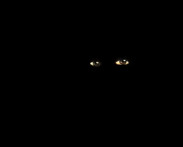
Erebos has set his eyes on eternal suffering, as shown by Michael C. Hayes's . Without a doubt one of the easiest artworks to identify.
Image 28:
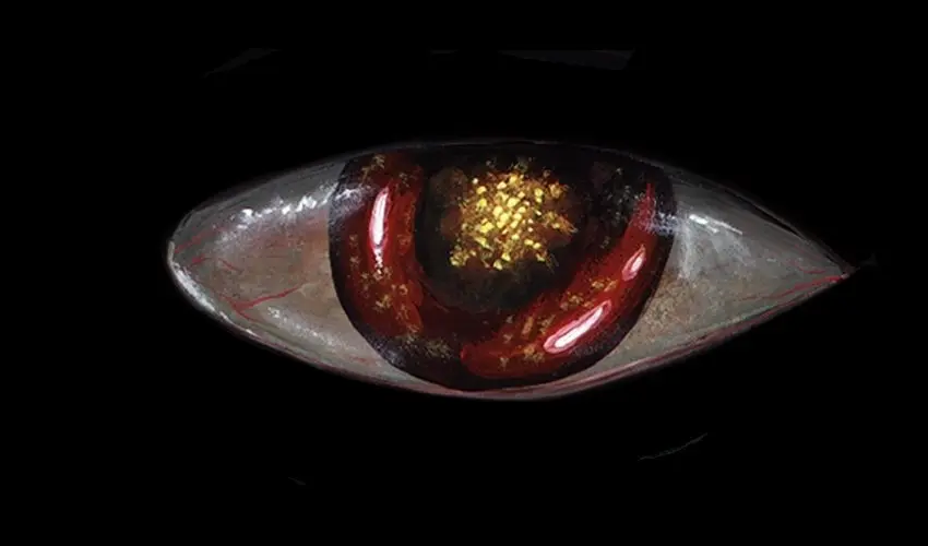
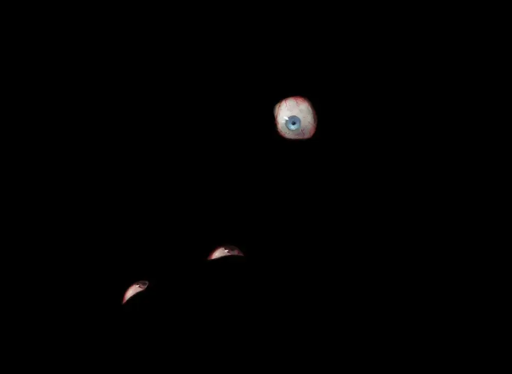
Fifth Edition's placed the Eye's eye at the center of some orb, a design later picked up again for . But when Jesper Myrfors created the original entry in the Eye line, he left the specifics of the creature a mesmerizing mystery.
Image 30:
Ekaterina Burmak beautifully captured the concept of in an Ikoria context. But why would you even try to kill such a cute monster?
Image 34:
Clint Cearly clearly shows as a sinister means of controlling people's minds. Previous versions of the card never fit the title that well.
Tier €2 = One Dozen Euros
Image 6:
As a card with entwine, is an elegant design, and the artwork by Darrel Riche matches the simplicity too a tee. This is the last card on the list with a title including the word "eye." I was surprised it lasted this long.
Image 8:
But there were still illustrations left that can't have been too tough. Mark Poole's was the first card to show mainly one disembodied eye.
Image 10:
When it comes to expressiveness, the eyes on Jason Chan's could rightfully claim a spot at the very top. And they do have to do all the talking, as the rest of the face is frozen in this unpersonal porcelain mask.
Image 11:
When folks on Otaria say, "Big Brother is watching you," they mean literally big. The rendition of the eye constitutes a technical improvement over the Thoughtlace above, but the most striking feature of Ron Spears's is the monstrous angle.
Image 24:
They don't do art like they used to anymore. earned Jeff Laubenstein a place in the Hall of Fame of visually unique Magic artistry.
Image 31:
It took an "old bastard" — their words, not mine — to identify this fairly obscure card from Mirage. Though it is, by peculiar happenstance, infamous among aficionados of a certain creature type. Susan Van Camp did a great job showing small woodland critters that are , but neither art description nor art director told her that those were originally supposed to be Squirrels.
Tier €3 – Apprentice Level
Image 3:
Look, sometimes you get (given) an idea and just have to roll with it all the way into the very goriest of details. Dan Scott's is the stuff of nightmares.
Image 12:
Brandon Kitkouski included two figures on , one without eyes and one with an abundance of eye. You can't see the former on the card itself, but its presence makes the piece all the spookier.
Image 15:
Christopher Rush counts among the finest of early Magic artists. Vibrant colors (turned darker in The Dark) and clean contrasts that work superbly at card size were defining features of the era. has it all.
Image 23:
Some of Ron Spencer's may look a little overcrowded, but his remains magnificent. Of course, his original submission, rotated counterclockwise by 90 degrees, had the terrorized being hide in the bottom left corner instead of the top left. But it didn't fit the aspect ratio of the card, so Alpha's production team simply made the creature "go up the wall." Years later, Spencer got to recreate the intended pose for a Magic Player Rewards promo — funnily enough with about the same aspect ratio, only this time according to specs.
Image 27:
The light! The details! The ambience! That glorious perspective! Not to mention the subject matter. With , Johann Bodin has created one of the most iconic Innistrad illustrations.
Image 35:
Here's a fun one. itself is a play on words, the flavor text features at least two jokes if we're being generous, and Mathias Kollros gave us a derpy-looking Crab to match. David Attenborough would approve.
Tier €4 – Getting Prickly
Image 4:
by Richard Whitters proved somewhat difficult, presumably because no one expects a trio of homunculi to get this angry.
Image 7:
by Pete Venters was the card that gave me the idea for this contest. I obviously can't recall, but according to the properties of the image file on my computer, which isn't even the same computer, I first blacked out in August of 2011. It's been a long while in the making, and I hope you enjoyed the challenge.
Image 9:
Changeling eyes aren't ideal for conveying human emotion, like surprise. Nonetheless Zoltan Boros & Gabor Szikszai pulled it off on . Just looking at the eyes, you can almost tell that the one in the background is staring in wonder at its own hands.
Image 13:
Eyes like headlights is a familiar trope, and Omar Rayyan's gives us the cleanest interpretation of it. How you skulk with these things is anybody's guess though.
Image 38:
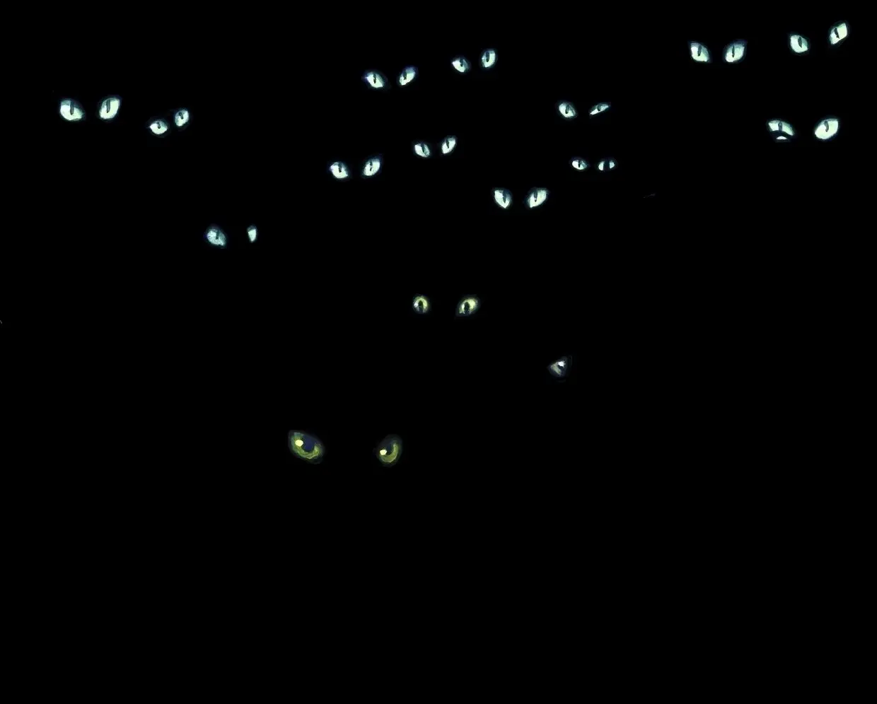
Izzy's features quite expressive eyes, flanked by very characteristic Cats that are already dark to begin with. It's also a recent card and one that's featured in the little sidebar where it says "More articles from TobiH." I had expected this to go way earlier than it did.
Image 39:
"Either terrified or extremely mad"? It almost seems as if the flavor text was written after Simon Dominic had handed in his . Because, if it was the other way around, then he absolutely nailed the expression.
Tier €5 – Brain Rackers
Image 5:
People variously suggested this to be , , or . It's not that Chris Rahn didn't find a fitting style here, it's more that is definitely archetypical.
Image 17:
Pete Venters is such a flexible artist. Hard to believe this is the same guy who gave us . had also made the shortlist of candidates for our Birthday Banquet a while back.
Image 19:
The Mark Poole style is somewhat distinct when it comes to eyes (with one notable departure) and 's eyes are quite unique too.
Image 29:
Michael C. Hayes got a second card as well, and it is one I had expected to go earlier. has so many "eye-dentifiers" from size and shape via expression to placement and number.
Image 32:
I had also thought to be long gone by this point. Jason A. Engle piece is full of the Ikoria-typical double-eyed monsters whose eyes are already glowing in the gathering dusk, after all.
Image 33:
Shadowmoor was all about finding the eerie even in colors and concepts not necessarily associated with evil. Steven Belledin's did a marvelous job.
Tier €6 – Well Versed in the Dark Arts
Image 14:
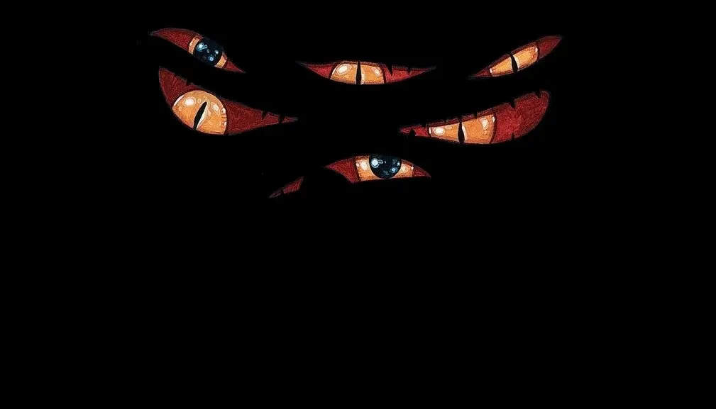
Ron Spencer is back. features his trademark style, almost going overboard with gruesome details, thankfully contrasted by a blank backdrop here.
Image 16:
It's maybe no Sistine Chapel, but Vance Kovacs painted a pretty impressive ceiling for . The play of the light on what little we see of the surroundings gives the impression of a vast cavern.
Image 20:
Pete Venters again, showing a mix of determination and trepidation on . After all, this scene presumably depicts Urza magicking up some kind of weapon, a man who'd already plunged the world into nuclear winter once.
Image 26:
James Ryman's tells the story of one poor soul who should never have listened to the Demon on his shoulder. And all for the power to read two pages at once.
Image 36:
Yeong-Hao Han takes the concept of a split personality to the extreme. splits the person into two again and again until nothing remains.
Image 40:
When I pitched this contest to my co-workers, and again when I argued for a high difficulty level, I pointed out that for every Magic card there's someone out there who's spent hours looking at the art. This likely explains how someone recognized Ryan Alexander Lee's . And one could pick worse art than this mix of romance and macabre. Death did not do them part.
Tier €7 – Ash to Cash
Image 22:
Matt Cavotta's was a bit of a mean inclusion because of its relative obscurity and lack of remarkable eyes. But it proved a clean, evidently solvable puzzle nevertheless. Though I'm not surprised it took one of the €7 spots.
Image 21:
There is a lot going on in the gnarly bark of by Brian Snõddy, though nobody can say it's ambiguous. I suspect the reason why this was the last card to be identified is that many may have missed the Treefolk's second eye at first glance.
Tier €0 – A Scathing Review
Image 18:
Yes, Franz Vohwinkel did include a person in the background of . Yes, they're as focused on the shiny spheres in the foreground as I imagine everyone else was when looking at the card. Those colorful spheres are even reflected in the eyes.
Image 37:
Just counting Standard-legal releases, Kev Walker's reinterpretation of is easily in the Top 5 of most reprinted Zombie illustrations of all time, and rightly so. (Only and the Dermot Power version of beat it by my tally.) Although the card is too weak by modern standards, this artwork even made it to Arena as part of the "Beginner Set." If you've never seen it before, you can count yourself as a winner now because this image of Zombies about to gorge on human flesh is indeed gorgeous.
Opinions expressed in this article are those of the author and not necessarily Cardmarket.