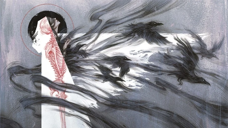
The Magic and Mysteries of Art
So, it's not like I have a degree from Lorehold or whichever Strixhaven college could bestow you with the means to quantify the prettiness of works of art. When it comes to judging Magic artwork, I have to rely on my guts, and as such my judgments are indeed idiosyncratic. Take them for no more than a place to start a discussion about the subject at hand and feel free to pitch in in the comment section below.


Art takes many forms. But when dealing with Magic cards, art is a two-dimensional representation on a rectangular piece of cardboard—not counting foils where Wizards' products are obviously curving into three dimensions these days. And also not counting textboxes which increasingly seem to be artfully written to replicate the sentence structure of James Joyce. Even without going to the extremes of the rotting pigs in the exhibition "Scene" by Christian Lemmerz or the canned "goods" of Piero Manzoni's "Merda d'artista" art can evoke strong emotions in the audience and indeed in the segments of the general public who generally don't give a damn about the subject.
The Devil Is in the Detail
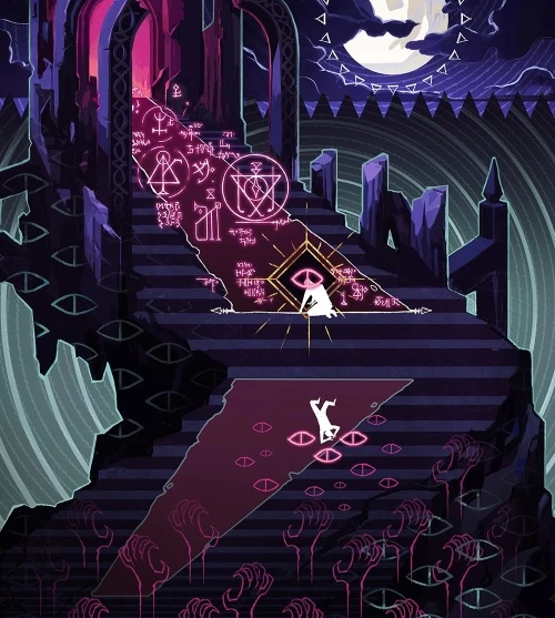
Also, when it comes to the more limited world of Magic card art, the subject can be a touchy one. In the early days of the game, art direction was loose and the results were of varying quality. Most players already know how early cards ended up attracting unwanted attention. Campaigns against the occult once sought to ban games and other forms of entertainment that they considered diabolic.


More recently, Wizards and the community at large have disowned other cards from the early days for artwork and names that have since come to be considered insensitive. The company has also taken a firm stance on the question if it is possible to separate the art from the artist and answered with a resounding no.
But even ignoring those factors and looking at pieces that no one as of yet finds offensive for religious or political reasons, art still divides. As two already famous cases from the upcoming Mystical Archive demonstrate, art controversy can both revolve around other moral issues and, as should indeed be expected from the subject: taste.
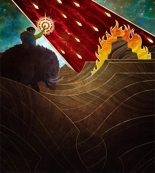
A Thousand Forgettable Cityscapes
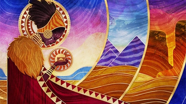
Art can offend because of what it portrays. Art can offend because of a dislike for the artist as a person. But art can also be judged as incompetent, as boring and bland, or people may just feel that an individual piece does not please them without even being able to say why. Of course art should not necessarily aim to please just as it should not necessarily be provocative.
I don't think I am alone in judging much recent artwork in our favorite game as monotonous, at times even impossible to recall and to distinguish from each other. I find the choice that illustrations generally follow a color scheme where the color of the card dominates a major offender.


Five-Finger Discount on Dragons
Another contributor to the thousands of forgettable illustrations of recent years has been the growing dependence on digital tools in particular for buildings and cityscapes. Luckily when it comes to Strixhaven's Mystical Archive the digital tools have been used for good—at least in most cases.

That the art director neither caught the stealing of the fan art by Kitt Lapeña nor the continuity break by giving Nicol Bolas five fingers is one thing. That Raymond Swanland's iconic art for
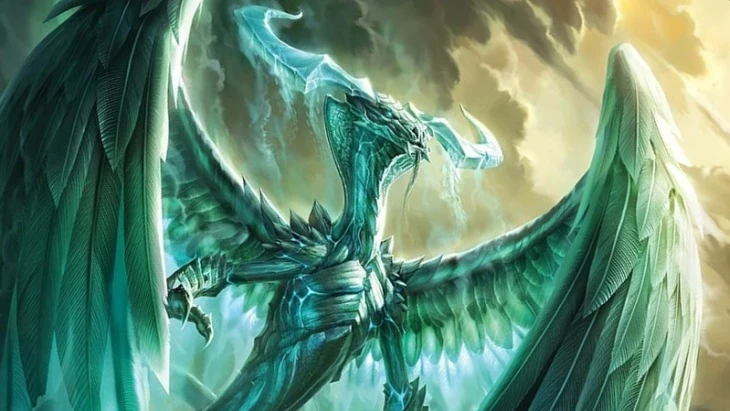
That particular use of the tools of the trade aside, like any other tool, digital painting and three dimensional renders can work great when they don't get to dictate the outcome. Mystical Archive's artwork generally has a very analogue feel to it compared to other newer releases. The variety in styles and the risks taken by the artists as well as by the art direction matches and at times surpasses that of both various Secret Lairs and the Double Masters box toppers. In short, I love the art of Mystical Archive. Or rather, I love the diversity in style the set brings to the game.
The Most Important Magic Art in Decades
And you know what? I think that Carly Mazur's work for
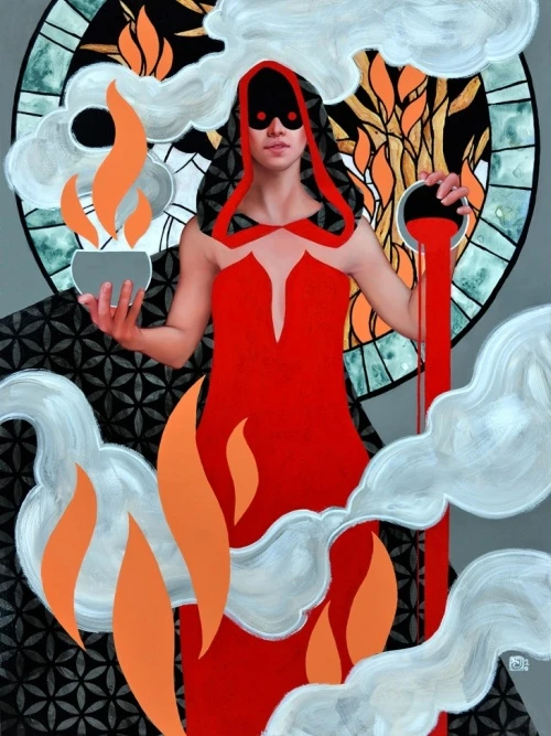
And I am very happy that Wizards went ahead and printed it.
I disliked the realistic representation of a human for a Magic illustration more than how the ultra-flat parts contrast with the curves of the limbs—which I think is an important part of what caused the strong reaction to Mazur's illustration. I am not saying that it is not a piece of art or that the artist is incompetent, merely that I don't like it. And that is exactly what I do like about it. Most other recent Magic art that I disliked has merely been boring and forgettable, whereas I think that this version of Faithless Looting will be remembered for a long time to come.
I prefer to see memorable art on Magic cards and it gives me some hope for a more varied visual style due to real art—as opposed to the coming deluge from Universes Beyond with Peppa Pig, Playboy Playmates, Pepsi, or whatever brands the Hasbro executives can strike a deal with. (Someone has surely suggested an all-foil expansion in collaboration with Pringles already.)
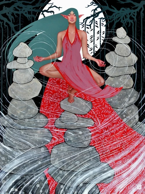
If you dislike the art of the new
Approach of the Rising Sun
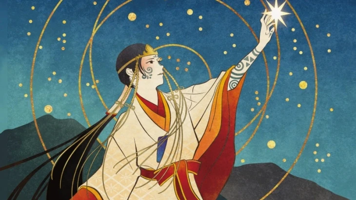
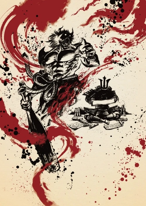
As you probably already know, Mystical Archive has two versions of each of its 63 cards. The cards come in a special Japanese version as well, whose artwork is inspired by various visual styles from across the ages of the country's history.


The Japanese cards are a chapter by themselves. They look gorgeous with the art coming right out to the borders on the top and most of the way down along the sides and the card names set in vertical text boxes. But alas, not being able to tell my Hiragana from my Katakana and not recognizing a single Kanji character, I will have to content with adoring their digital versions. I prefer only to play cards that I am certain both I and my opponent can read on the spot without having to look them up.


Personally I prefer the old traditional Japanese art over the manga style, and I think that


Anyway, that's my take on the set. As always I would like to hear what you all think. Does Strixhaven: Mystical Archive represent the beginning of a new interesting era in Magic art, or would you prefer something completely different? Or perhaps you think that art is superfluous distraction and you wouldn't take much notice if everything were in the style of Mystery Booster playtest cards? Voice your views in the comment section below!
Opinions expressed in this article are those of the author and not necessarily Cardmarket.